
A line chart is usually the better starting point when you need to see the broad direction of a currency pair quickly. A candlestick trade chart is usually better when the timing, range, and structure of each price period matter. Neither view predicts the next move; the useful choice is the one that makes the decision in front of you easier to inspect.

The short answer: use the chart view that matches the job
For most forex traders, the practical answer is not line or candlestick forever. Use a line chart to reduce visual noise and check whether price is broadly rising, falling, or rotating. Use candlesticks when you need to see the open, high, low, and close within each selected period. A simple workflow is to start with the line view for context, then switch to candles before planning an entry, stop location, or invalidation level.
This distinction matters in global forex because a pair can look smooth over a daily close yet trade with sharp intraday swings around overlapping sessions, central-bank announcements, or thin-liquidity periods. The display does not change the underlying price, spread, financing cost, or execution conditions. It only changes how much of each period’s path you can see.
What a line chart and candlestick trade chart actually show
Line chart: one selected price per period
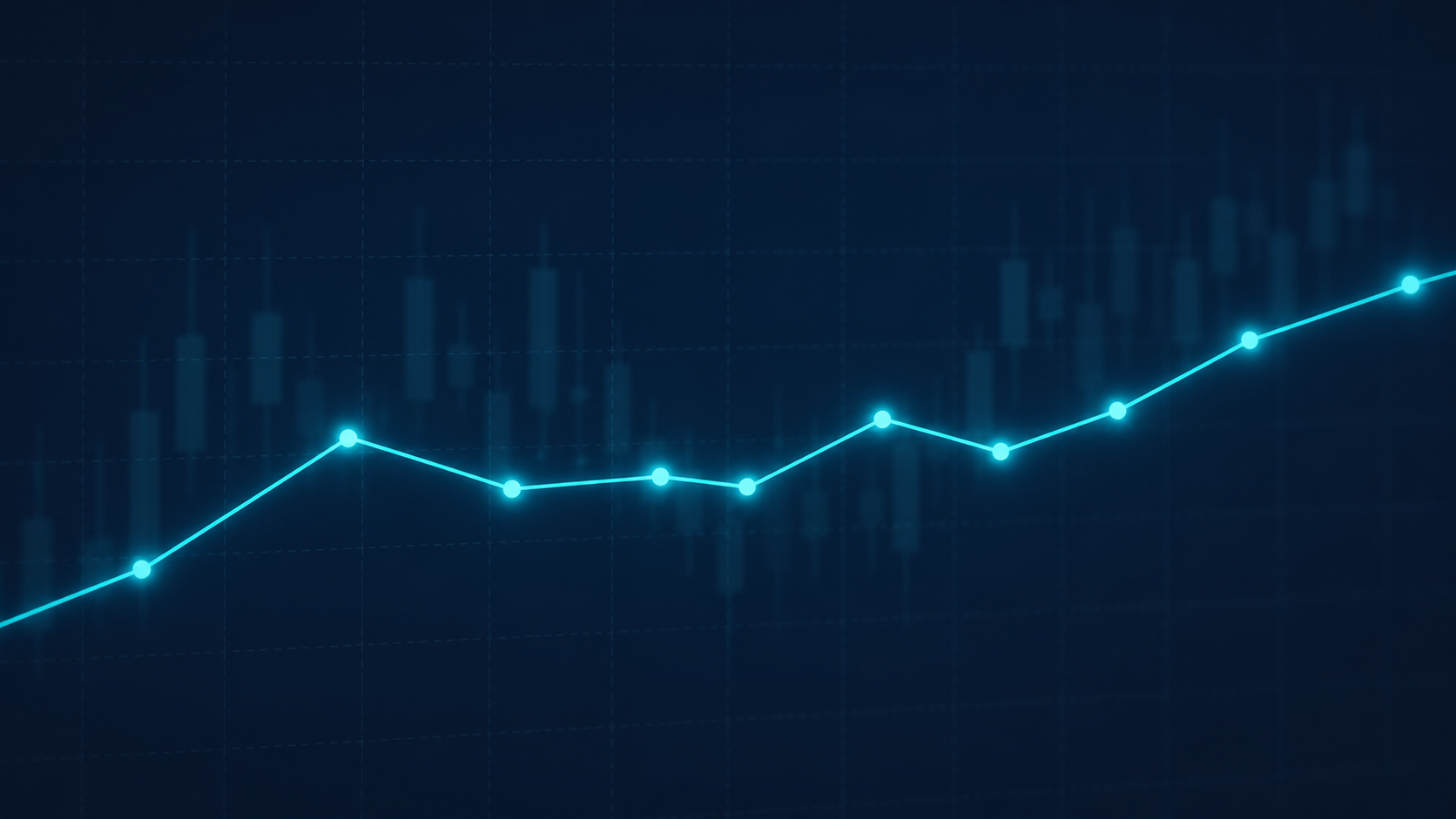
A classic line chart connects one price from each bar—most commonly the closing price. On a one-hour EUR/USD chart, for example, each point typically represents the close of one hourly period. Removing the high-low range makes the larger path easier to scan, especially on a smaller screen or when comparing several currency pairs.
Candlestick chart: the range inside each period
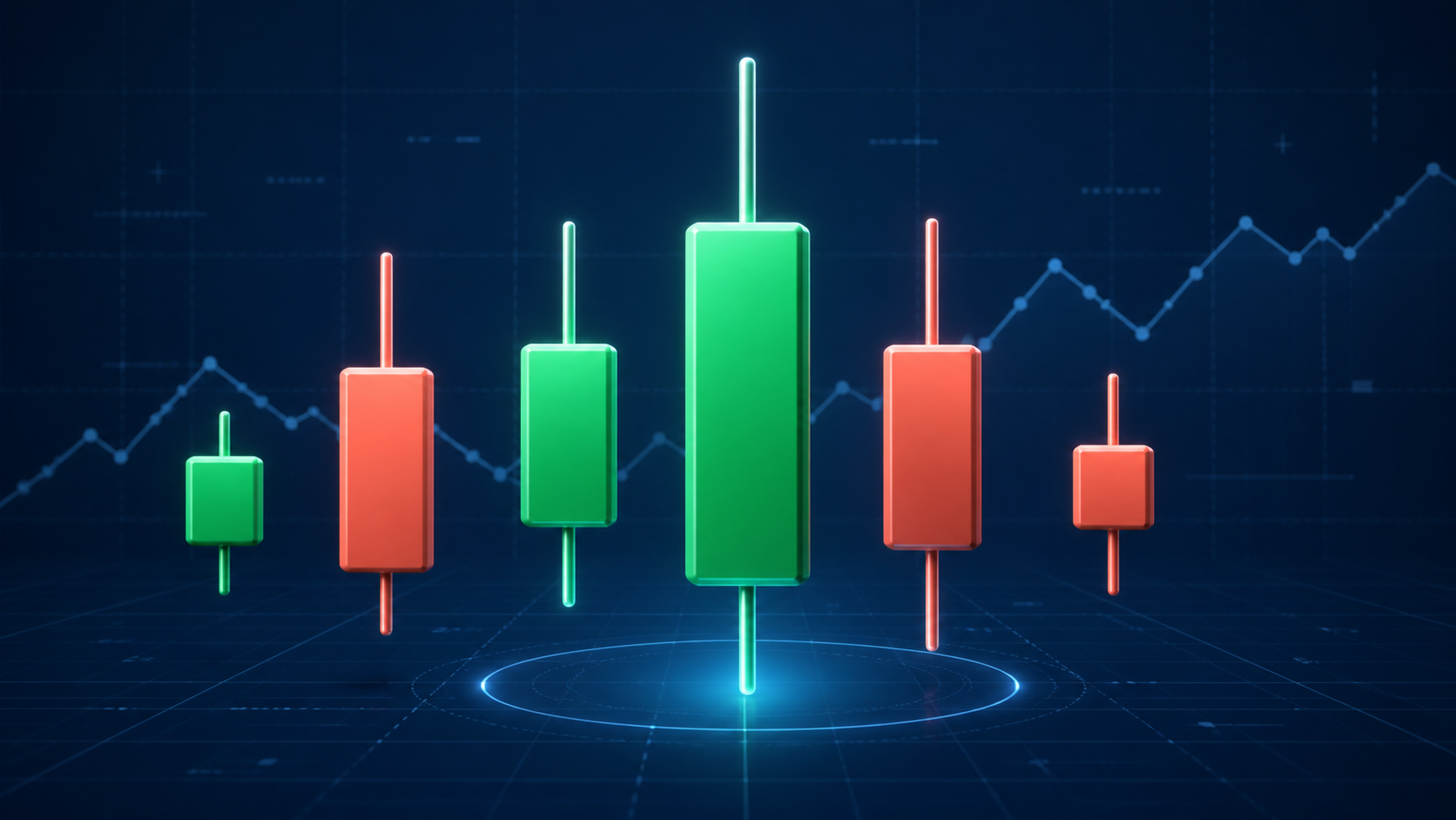
Each candlestick represents the open, high, low, and close (OHLC) over the chosen timeframe. The body shows the distance between open and close; the wicks show the period’s extremes. That extra information can reveal rejection, expansion, compression, or a close near a period’s high or low—details a line chart intentionally hides.
Line chart vs candlestick chart at a glance
| Decision point | Line chart | Candlestick chart |
|---|---|---|
| Primary information | Usually one price per period, often the close | Open, high, low, and close for each period |
| Best for | Trend scans, broad support/resistance areas, portfolio-level review | Entry planning, price-action context, volatility and range inspection |
| Strength | Lower visual noise; rapid comparison across pairs and timeframes | More context about how price travelled within the bar |
| Main blind spot | Hides intraperiod highs, lows, and rejection | Can invite over-reading of single-bar patterns and create clutter |
| Useful default | Higher-timeframe overview | Execution timeframe after a plan exists |
When a line chart is the better choice
Choose the line view when clarity is more valuable than bar-by-bar detail. It is especially useful for checking several major, minor, or cross pairs without getting pulled into every intraday wick.
Scanning the higher timeframe: Daily and four-hour closes can make broad direction and major turning zones easier to compare.
Marking zones instead of exact ticks: A line chart can discourage false precision when a level is better treated as an area.
Reviewing a watchlist: The clean view is useful when you need to distinguish a persistent move from a range across many symbols.
Reducing emotional noise: Traders who react to every wick may benefit from stepping back to a close-based picture before changing a plan.
Working on mobile: On a small display, a clean line may communicate a trend more clearly than tightly packed candles.
The limitation is important: a close-only view can make an apparently orderly move look calmer than it was. If your decision depends on whether price tested and rejected a level during the period, return to candles before acting.
When candlesticks are the better choice
Candlesticks are more useful when the shape of the trading period changes the quality of the setup. A long wick, a narrow range, or a close near an extreme is not a trade signal by itself, but it may provide context for a plan that already has defined risk.
Timing around a marked zone: Candles show whether price approached a zone smoothly, rejected it quickly, or closed through it.
Measuring range: The high-low span helps assess whether a timeframe is expanding or contracting before you set an order size or stop distance.
Comparing session behaviour: The London, New York, and Asia-Pacific sessions can produce different liquidity conditions; candles make the intraperiod range visible.
Checking event risk: Around scheduled economic releases, candles reveal the size and speed of movement that a closing line may mask.
Keeping a trade journal: Candlestick screenshots can make it easier to review the context of an entry and exit later.
The trade-off is cognitive load. A dense candlestick trade chart can tempt traders to assign too much meaning to every pattern. Keep the number of indicators, drawings, and timeframes restrained enough that you can still state the trade idea in one plain sentence.
A practical chart-selection framework for forex

Name the task. Are you scanning direction, defining a zone, timing a trade, or reviewing an existing position?
Start wider than the entry timeframe. Use a line chart or uncluttered candles on a higher timeframe to locate the broader context.
Move to candles only when range information changes the decision. Check the bar structure, current volatility, and nearby scheduled events.
Define risk before the order. A chart can inform an invalidation point, but it cannot make a leveraged position safe.
Keep the same rules after the trade opens. Do not switch chart styles merely to find a reason to override a pre-defined exit rule.
This approach separates analysis from visual preference. It also works across time zones: a trader following GBP/USD from Singapore may use the daily close for context, then inspect candles near the London open; a trader monitoring AUD/USD in Europe may do the reverse around the Asia-Pacific session.
Use both views in a multi-timeframe workflow
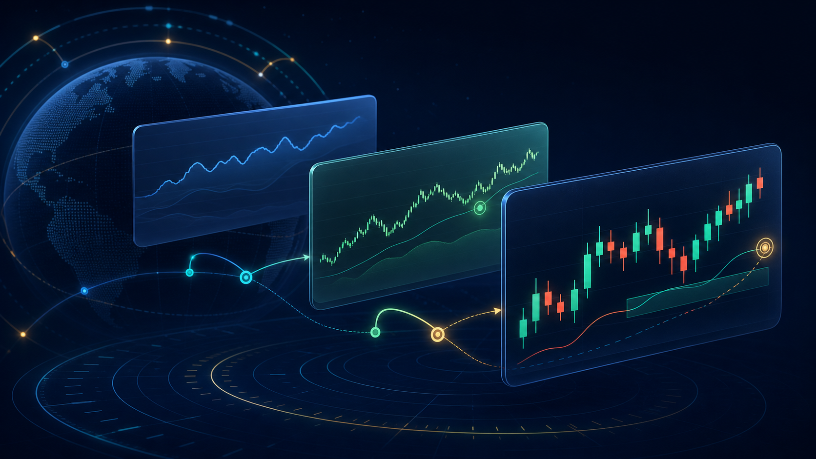
A practical routine can look like this: review the daily or four-hour chart for broad structure; mark a small number of zones; use a one-hour or 15-minute candlestick view only if your method needs a closer look. The exact timeframes should reflect your holding period, available monitoring time, spread sensitivity, and the rules of the instrument—not an internet template.
If you trade shorter timeframes, build transaction costs into the decision. The U.S. Securities and Exchange Commission’s investor education site notes that transaction costs can turn otherwise profitable forex trades into losing ones, particularly where traders move in and out frequently. Read the relevant account agreement and pricing disclosures before treating a small chart move as a tradable opportunity. Investor.gov’s forex risk overview provides a useful plain-language starting point.
Global forex considerations that a trade chart cannot solve
Chart choice is only one part of the trading workflow. In retail OTC forex, the dealer, account entity, currency pair, leverage settings, and local rules can materially affect the experience. Regulation and available protections are jurisdiction-specific. Confirm that a provider is authorized to serve you where you live, read its risk disclosure, and understand deposit, withdrawal, margin, and negative-balance terms before funding an account.
Leverage magnifies both gains and losses, and a line chart does not reduce that effect. The U.S. CFTC’s forex customer advisory explains key retail risks, including counterparty, platform, margin, and fraud considerations. It is U.S.-focused, so traders elsewhere should also consult the applicable local regulator and the broker’s local-entity documents.
Where FXBee can fit into the research process
Once you know how you want to read a trade chart, use the same discipline when researching providers. Compare the published account conditions, eligible regions, platforms, fees, risk disclosures, and support process; do not choose a provider solely because a chart layout looks familiar. FXBee’s broker comparison page and support centre are relevant starting points for questions about the site’s listed services. Review the site’s Terms of Use before relying on any information or promotion.